
How I Created Microinteractions for Social Icons in Framer
Framer Features

✨ Introduction
As a designer focused on details that drive engagement, I recently spent a few hours exploring microinteractions inside Framer. The goal was simple: animate a social media icon on hover to create subtle, delightful feedback.
It might seem like a small thing — but these little touches help build intuitive, polished experiences. Here’s how I made it work (and what I learned along the way).
🎯 What I Wanted to Achieve
A hover animation for a social icon (e.g., Instagram, Twitter)
Smooth scale, color shift, or bounce effect
Fully responsive and reusable across the site
🛠️ Tools Used
Framer Smart Components
Hover triggers with variant switching
Frame-level overflow control (like a
viewBox)Optional: easing curves (
Ease In-Out,Spring)
🔧 Step-by-Step: Creating a Smooth Microinteraction with Layered Icon States
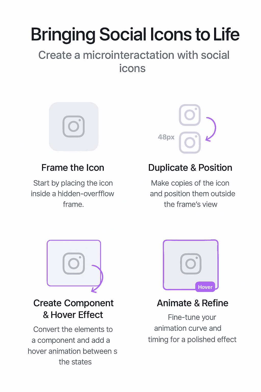
1. Framing the Icon (The Foundation)
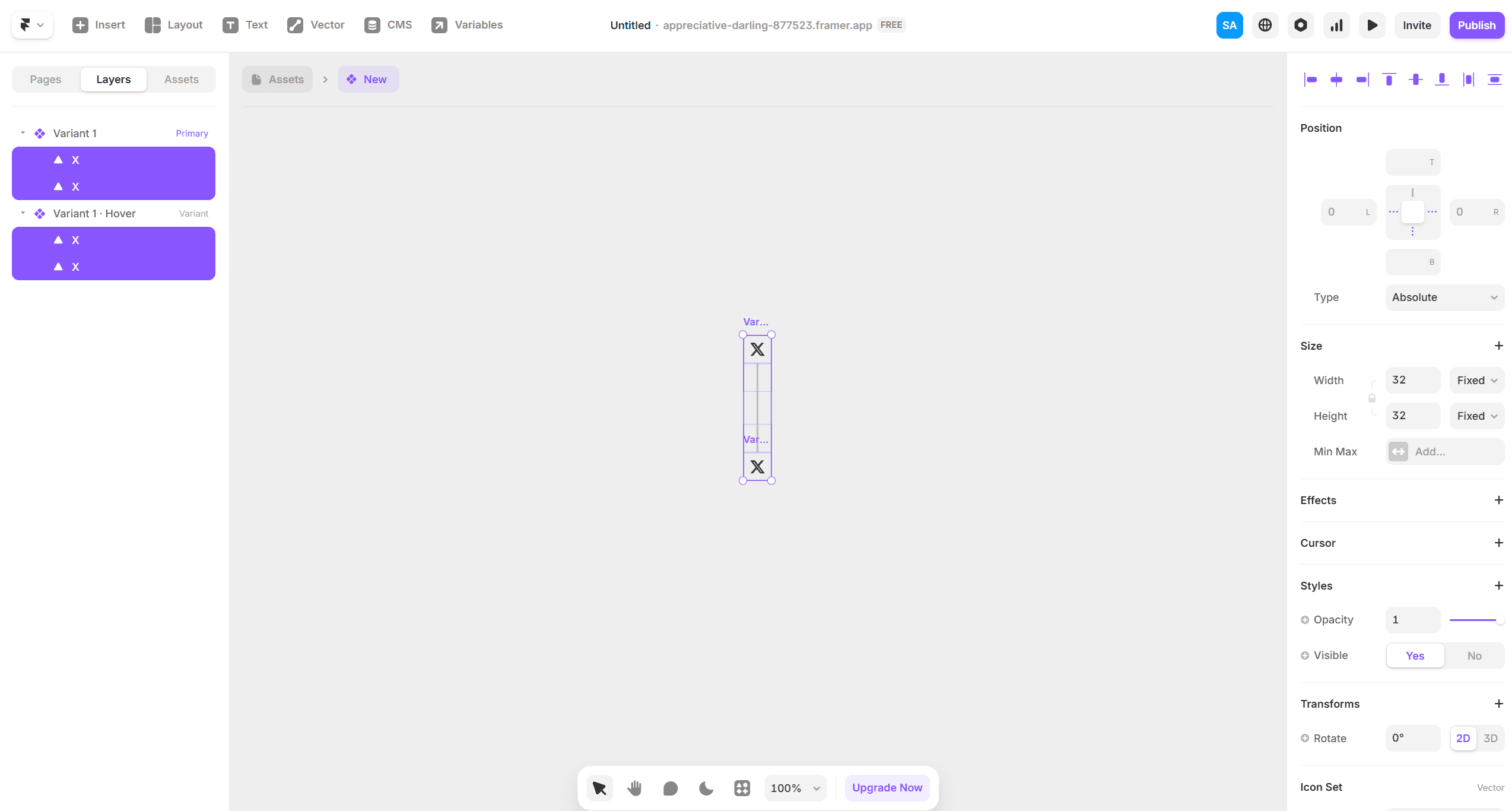
I started by placing the social icon inside a clean 48×48 frame. This frame acted like a boundary box — similar to an SVG viewBox. I set the frame's overflow to “hidden” to make sure any animation beyond this box would be neatly clipped, keeping the motion tight and intentional.
2. Duplicating and Positioning the Animation States
Before creating a Smart Component, I duplicated the original icon three more times, giving me a total of four icon states within the same parent frame.
Then I:
Moved the final state icon (4th one) into position at the top (default visible)
Pushed the next state (2nd icon) -48px below and set its opacity to 0
Did the same for the third icon, keeping it out of view with 0 opacity
Positioned the first (original) and fourth icon to handle the transition entry/exit
All of this was still inside the original frame, now acting as a “slide window” for animation.
3. Creating the Smart Component with Variants
Once all icon frames were arranged, I converted the group into a Smart Component.
Then I added a hover variant, where:
The fourth icon (the final visual state) shifts up by 48px, sliding into view
The second and third icons remain invisible (opacity 0, out of frame)
Parent frame’s overflow stays hidden, so the upward motion looks clean and contained
4. Bringing It to Life with Motion Tweaks
In the hover interaction settings:
I applied a custom “spring” animation
Tuned the stiffness and damping for a soft ease-in-out effect
Result: The icon slides up smoothly with just the right amount of bounce — polished and subtle
🧠 What I Learned
Even the simplest animations take time to finesse
Smart Components in Framer make microinteractions scalable and reusable
Small animations create emotional feedback, making interfaces feel alive
This was a small but satisfying win. It’s now a reusable component I plan to use across future projects — especially personal brand websites, SaaS homepages, and creator portfolios.
If you're a founder, artist, or brand looking to elevate your site with purposeful design details, I’d love to work with you.
📩 Contact me